Hyve rebrand
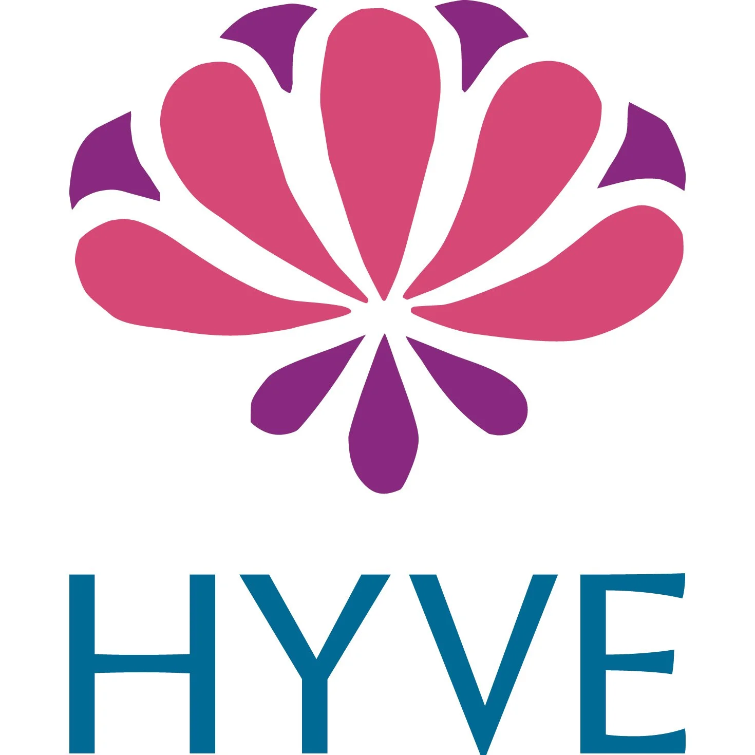
Hyve’s new logo is as much a new chapter in a long story as a rebranding. Originally a partnership and now individually owned, the firm is a strategic consultancy for nonprofits in planning, leadership and facilitation. Reflective of Hyve’s work, the logo is based on the clover flower, a resilient and elegant natural resource.
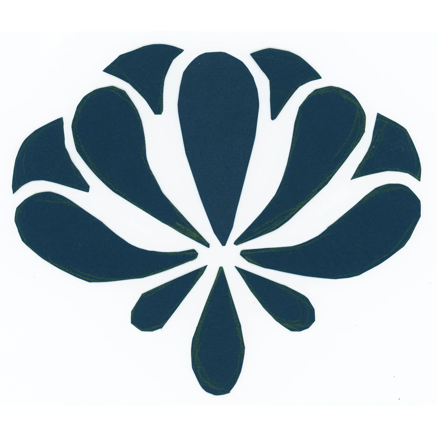
The usual design process of presenting a few options, limited revisions, etc. didn’t feel right given the nature of Hyve’s organic evolution. Instead, we iterated together, back and forth as needed until arriving at the right solution. The colors are bright and energetic, and the mark started with cut paper shapes, making the flower unique and individual - perfectly imperfect.
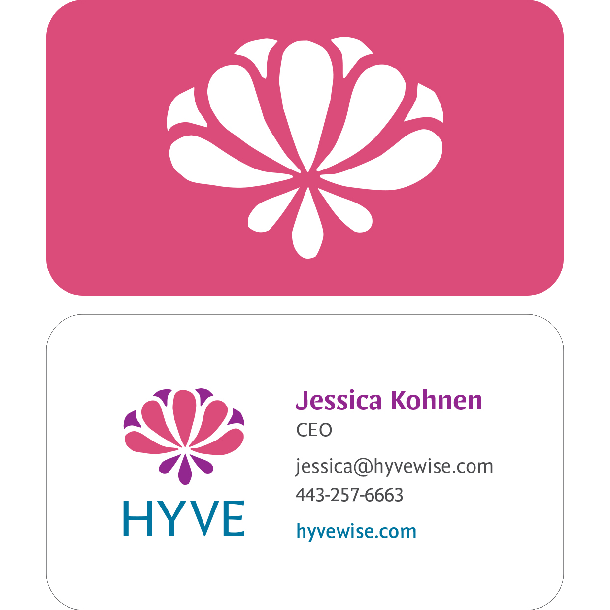
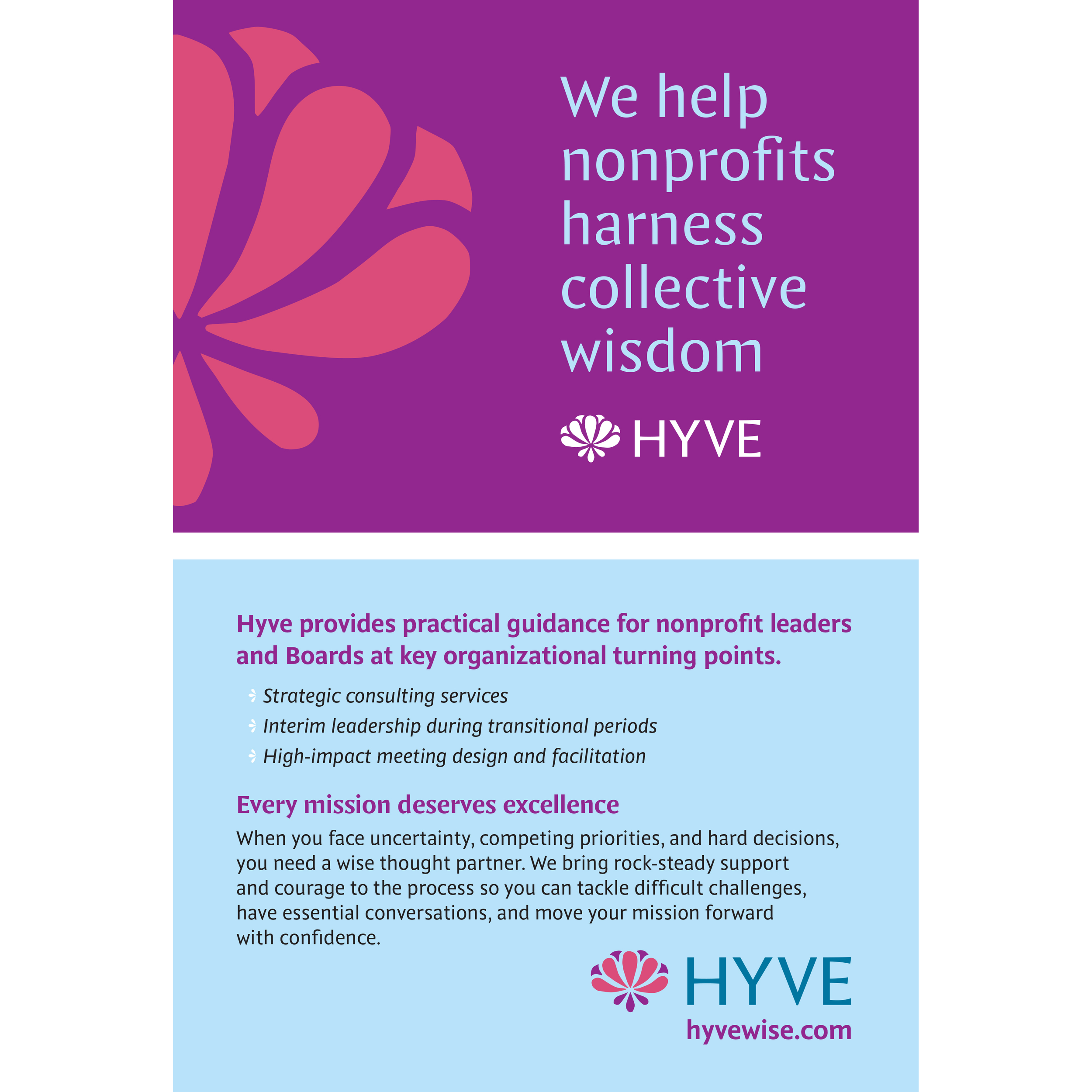
Collateral and implementation included document templates, a style guide, business cards, a postcard, a tabletop banner, and a branded tablecloth for events.